Digital Paper for Tarot Card and Mystical Design
Digital paper has emerged as a powerful enabler for tarot card creators and mystical designers. It blends the organic warmth of traditional textures—parchment, vellum, and stained storytelling—with the flexibility of modern software. The result is a surface where symbols glow, borders breathe, and divination imagery feels both ancient and futuristic. When you work with digital paper, you’re not just applying a texture; you’re setting the atmosphere for every card, spread, and rune binding you create.
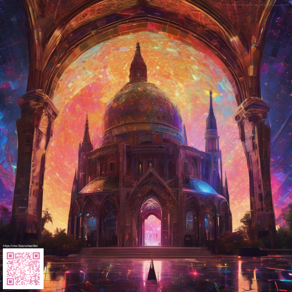
One of the most exciting aspects is how digital paper can simulate depth and luminosity without sacrificing repeatability. Designers can layer translucent gilding, feathered ink, and celestial gradients to craft cards that read as if they’ve aged under moonlight. The top image captures a Solana-inspired overlay style, a reminder that digital textures can carry motifs of crypto-era mysticism and timeless divination at once. It’s this versatility that makes digital paper a staple for anyone aiming to evoke mystery with clarity and precision.
Texture, tone, and the language of light
Texture is more than a visual detail; it’s a storytelling device. A carefully chosen digital paper texture can convey mood—crisp parchment for a formal court, warm vellum for an intimate oracle, or a cosmic sheen for a deck steeped in star-wheel symbolism. The tonal range matters, too. Subtle grain adds authenticity, while controlled bloom around glyphs can guide the viewer’s eye to sacred symbols. By manipulating light interaction—specular highlights, soft shadows, and edge wear—you can create a tactile reading experience even when the art exists purely in pixels.
- Resolution matters. For print-ready tarot decks, aim for high-resolution textures (300–600 ppi) to preserve detail in fine lines and gilded borders.
- Seamless tiling. When you need repeating backgrounds behind card borders, ensure textures tile without obvious seams so the design remains cohesive across multiple cards.
- Color management. Work with standardized color profiles (sRGB for screen, Adobe RGB or CMYK for print) to keep reds, golds, and ultramarine tones consistent across devices and printers.
- Layering strategy. Use non-destructive layers: base texture, secondary overlays (crystal dust, mist, or sigils), and a final glaze to unify the composition.
“Digital paper isn’t just a backdrop; it’s a collaborator. When I layer textures with thoughtful lighting, the cards begin to speak in a language that feels both ancient and algorithmic.”
In practice, you’ll blend textures with your artwork rather than letting them dominate. For tarot imagery, this means preserving legibility of numerals and symbols while letting the paper texture add character behind the main motifs. Subtle grain under sympathetic color harmonies can make court cards pop, while a soft, moonlit veil over the trigrams can heighten the sense of mystery around Major Arcana symbolism. The result is a deck that photographs beautifully and reads clearly at the table.
To many artists, the desk setup matters almost as much as the design itself. A reliable workspace surface keeps brushes, stylus, and paper clips from slipping—especially when you’re aligning intricate borders or applying delicate gilding effects in your digital workflow. For a practical touch of physical stability, consider equipment that helps you stay grounded during long sessions. For instance, a sturdy, non-slip surface can be a simple yet effective companion to your creative process. You can explore options like the Non-slip Gaming Neon Mouse Pad Polyester Surface to keep your setup steady while you iterate textures and overlays in your software.
When preparing digital papers for a tarot or mysticism-inflected collection, think about how they interact with your design tools. Import textures as smart objects when possible, so you can experiment with non-destructive edits. Try overlaying a faint star-field on major arcana cards and then dialing back the opacity to ensure the symbols remain the focal point. If you’re working toward a print release, test a few proofs to confirm that the texture translates well from screen to paper, especially in areas with fine linework or metallic finishes.
For readers who want a broader context on this topic, there are additional insights and inspiration available on related resources. The process of adapting digital textures for mystical design is a growing conversation, and you’ll find practical ideas tied to real-world palettes and techniques on our reference page.
As you experiment, keep one eye on the practical: ensure your textures are flexible enough to support multiple card formats, print sizes, and coloring systems. The right digital paper can accelerate your workflow by reducing repetitive edits and helping you focus on storytelling through imagery. The key is to balance texture with clarity, ensuring that every rune, sigil, and symbol has room to breathe on the card face.