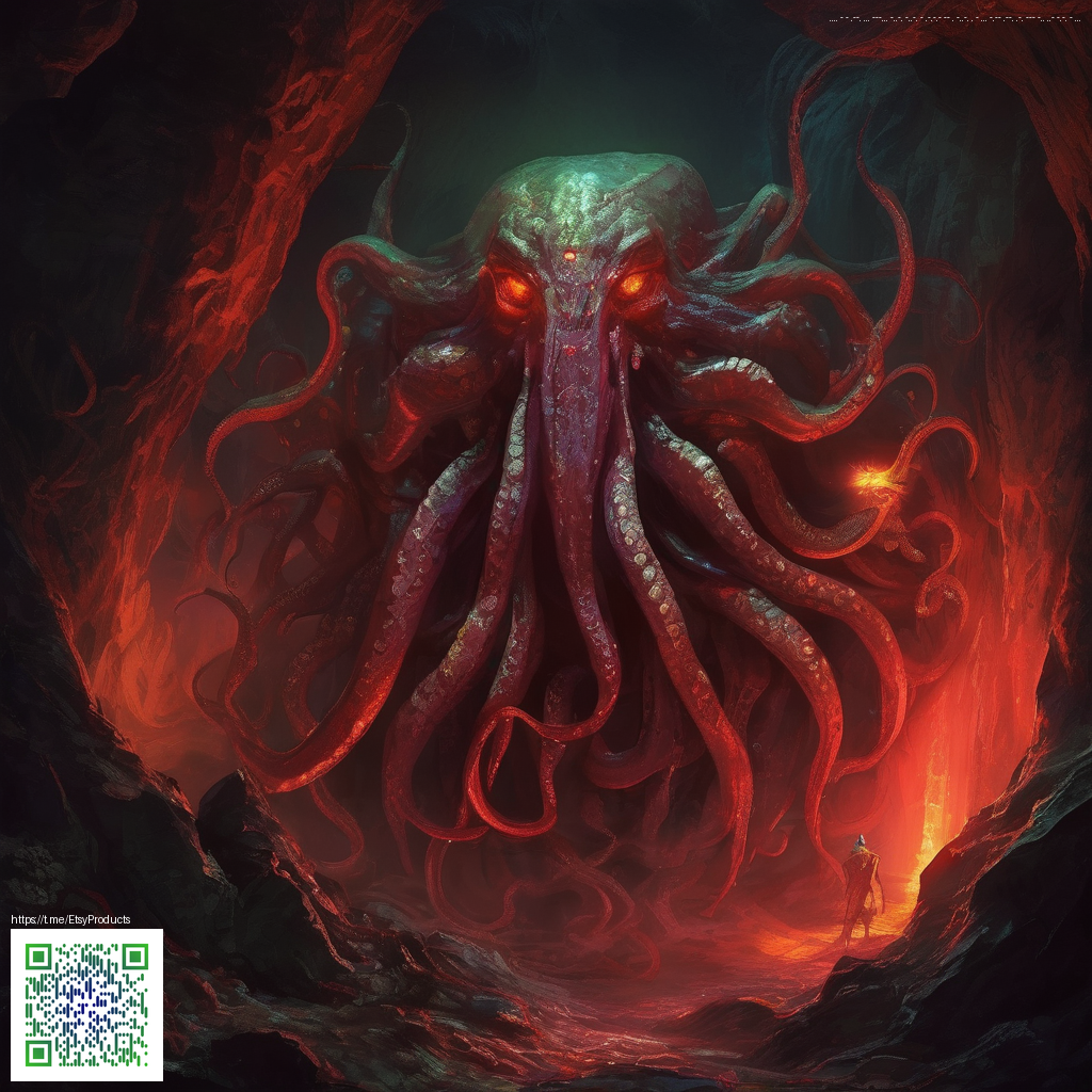
In the realm of photo manipulation, blending digital paper textures is less about decoration and more about constructing tactile depth. When done right, textures feel like a natural extension of light and material in your scene — adding atmosphere without shouting for attention. The result is a composition that reads as cohesive, with texture guiding the eye and enriching the narrative of your image.
What digital paper textures bring to your workflow
Digital paper textures function as versatile material passes in your toolkit. They can simulate delicate handmade papers, gritty newsprint, or glossy stock, depending on how you edit and blend. The most important principle is to treat texture as lighting and surface information rather than a flat layer. By adjusting opacity,ลอง blending modes, and selective masking, you reveal just the right areas — edges, creases, or reflections — where the texture can convincingly live.
How to select textures that pair with bold lighting
Begin with a small library of textures that cover a spectrum of density. A light grain works beautifully for airy composites, while a heavier texture can anchor surreal scenes. Pay attention to the texture’s color; neutral or slightly warm tones tend to harmonize with skin tones and landscapes more smoothly than cool blues. For inspiration, consider texture packs that emphasize modern palettes and neon accents, which translate well into digitally manipulated work.
“The trick isn’t to plaster texture on top — it’s to let it breathe with the light in your scene.”
Practical blending techniques that yield realism
Blending is where texture becomes believable. Here are actionable steps you can apply in your next project:
- Layer modes: Start with Soft Light or Overlay to merge texture with midtones and highlights. If the result looks muddy, switch to Screen for lighter outcomes or Multiply to deepen shadows.
- Masked reveals: Add a black mask and paint with a soft brush to reveal texture gradually. Target edges, fabric folds, and reflective surfaces to simulate how real textures behave.
- Color harmonization: Tweak via Curves or Hue/Saturation to align the texture with the overall color grading. Tiny shifts in warmth or coolness can eliminate the “stock texture” feel.
- Directionality: Align the texture grain with the scene’s light direction. Proper alignment reinforces realism and prevents the texture from looking pasted on.
In practice, draw ideas from objects around you. For instance, a neon-accented gadget can inspire tempting texture directions and color interactions. If you’re curious to see how such design ideas translate into real-world products, check out the Neon MagSafe Card Holder Phone Case, which demonstrates how bright accents interact with surface texture in everyday lighting. Neon MagSafe Card Holder Phone Case offers a useful tactile reference for color and sheen that you can emulate in digital textures.
Enhancing micro-details for credibility
High-end manipulations benefit from micro-details like subtle dust motes, tiny scratches, and faint lens flare. Add a texture pass at a low opacity (around 5–15%) and mask carefully to avoid overdoing it. Keeping adjustments non-destructive lets you experiment with different lighting directions and color grades without losing control over the texture’s role in the composition.
The right texture adds tactility; the wrong one distracts from the story.
Workflow habits that keep your results consistent
Consistency across a collection elevates your portfolio. Build a small texture kit with:
- Two or three grain densities
- A handful of color-tinted textures
- Texture-specific masks for sky, skin, and metallic surfaces
As you refine your process, treat the texture layer as a separate pass. This separation makes it easier to explore multiple lighting scenarios and color grades while preserving the surface feel. When you present a series, the textures should feel like a shared language across images rather than a one-off trick.
If you’re looking to spark ideas, explore texture libraries that emphasize contemporary palettes and neon aesthetics. Remember, digital paper blending is a toolkit of techniques rather than a single trick — and the best results come from building a library of textures that respond to light and environment just as real paper would.