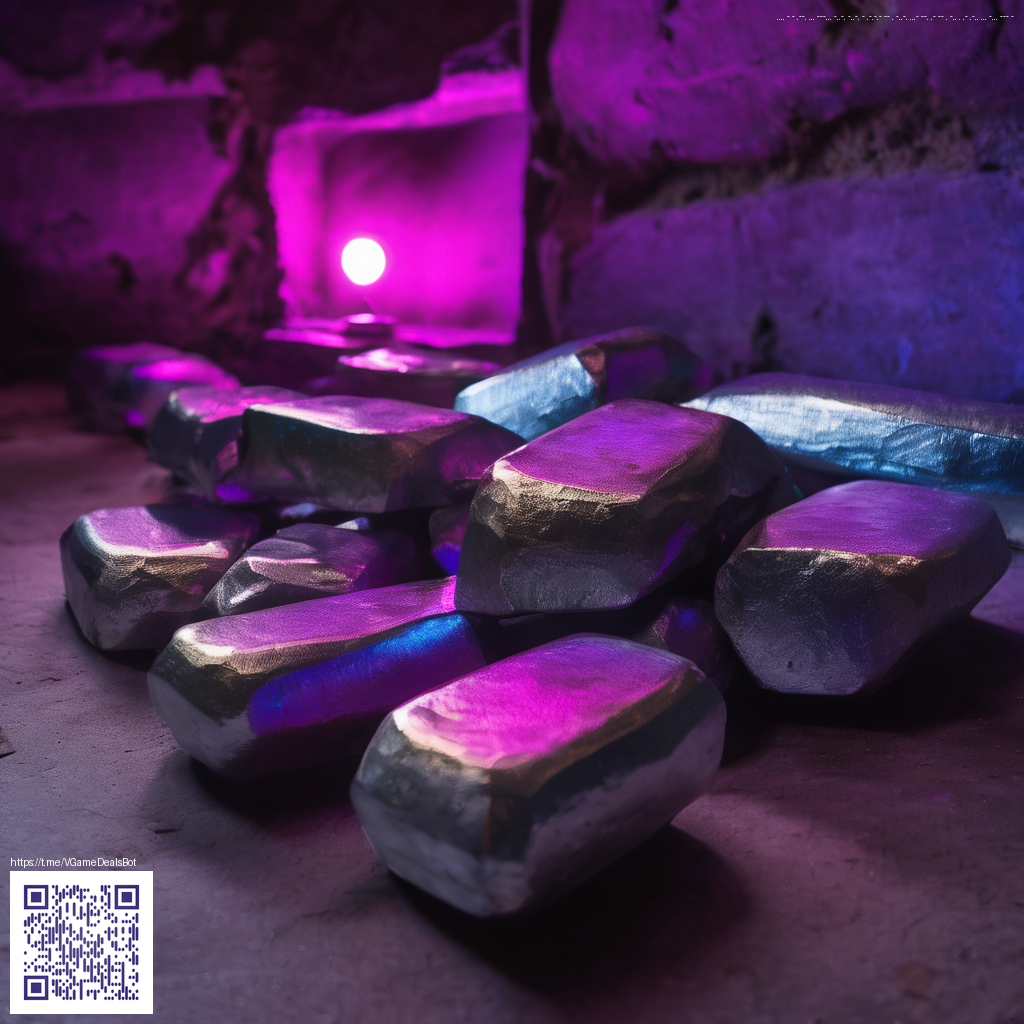
Immersive Layered Paper Techniques for Poster Design
In the world of cinematic posters, the texture of real paper can add a tangible depth that digital treatments sometimes struggle to emulate. Layered paper overlays act like miniature dioramas: each strip, edge, and shadow contributes to a mood that a single flat print cannot achieve. The trick is to arrange translucent and opaque layers to capture light in a way that feels both tactile and cinematic. This approach blends craft with design, inviting viewers to lean closer and discover the storytelling embedded in the textures.
Materials and Approach
Start with a simple toolkit: heavyweight craft paper, kraft or white Bristol, a craft knife, a cutting mat, and archival adhesive. The strength of layered overlays lies in contrast—thin, almost translucent sheets stacked over bolder shapes create a sense of depth. By varying edge treatments (scored, torn, or clean-cut), you can simulate distance and atmosphere. When planning your composition, sketch a rough silhouette first, then build the layers outward, keeping track of the light source to preserve natural shadows.
- Quality blade and self-healing cutting mat for precise, repeatable cuts
- Different paper weights and finishes (matte, vellum, and slightly translucent options)
- Adhesives that dry clear and allow easy repositioning during layout
- Light modifiers such as subtle backlighting or raking light to reveal texture
Techniques for Depth and Mood
One effective method is to stagger shapes with a gentle tilt, creating an artificial perspective. Place a bold foreground element on a thicker sheet, then layer mid-ground scraps on lighter stock to simulate distance. The key is to let the light skim across the top edges—tiny rips or baby folds catch the glow, giving the image a tactile presence. While you could digitally simulate this effect, physical overlays offer a unique warmth and organic irregularity that resonates with fans of classic film posters.
“Texture is a storytelling device. When a poster wears its textures, it invites the viewer to touch with their eyes, and that emotional cue sticks longer.”
In practice, you’ll often combine painted or inked flourishes with paper cuts to achieve a cohesive look. A careful balance between negative space and stacked layers helps prevent the composition from feeling cluttered. If you photograph your work, shooting with a soft, directional light can accentuate the paper’s grain and the subtle overlaps, turning a flat idea into a cinematic moment.
Practical Workflow Tips
Before you begin, assemble a small palette of color swatches inspired by your film reference. Then, lay down a base layer and build with progressively smaller shapes. The process rewards patience: test-fit, then re-cut, shift, and re-light until the mood reads correctly at poster size. A portable on-set tool can be surprisingly helpful for quick reference while you arrange elements. For instance, a compact phone grip stand can keep a reference phone steady when you’re toggling between sketches and photographs.
In addition to physical handling, you can weave subtle digital adjustments into your workflow. Scan your layered piece and use digital overlays to preview how the final print will look, adjusting color balance and contrast before committing to final cuts. A case study you can explore for inspiration is on https://y-vault.zero-static.xyz/854485a0.html, which showcases how careful layering and light treatments elevate mood and legibility in posters.