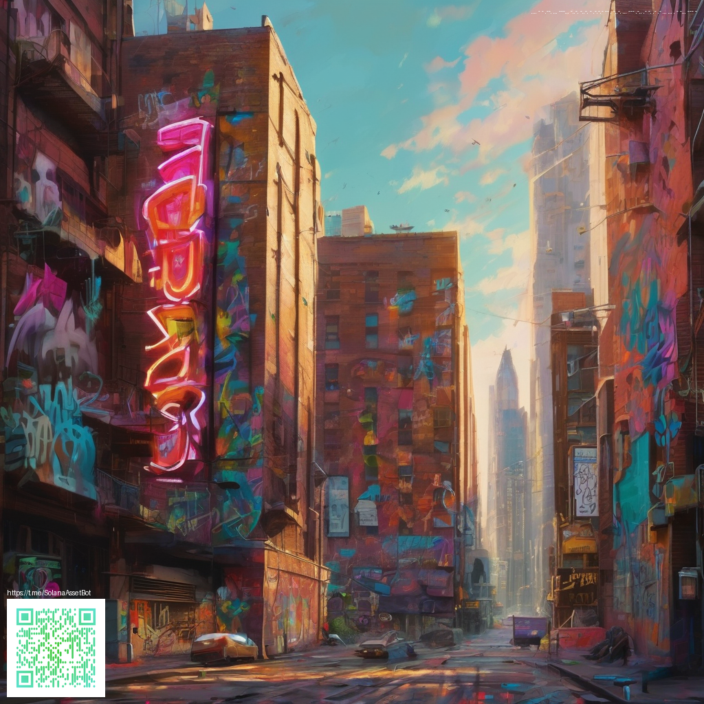
Layered Overlays and Digital Paper: Crafting Unique Visual Effects
In modern design, the magic often happens where textures meet color. Mixing overlays with digital paper gives you the power to add depth, warmth, or edge to images without changing the core composition. Digital paper provides a library of scanned textures and patterns, while overlays—think gradients, soft light layers, and photographic textures—add personality. When used together thoughtfully, they can transform a flat photograph into a layered narrative that communicates mood, brand voice, and nuance.
What digital paper brings to the table
Digital paper acts like a tactile background you can tweak, mix, and re-tint. It can simulate grain, fibers, or subtle marbling, making your visuals feel tactile even on screens. It’s about selecting textures that complement your subject rather than compete with it. For instance, a neon-edged product shot can benefit from a light, subtle paper texture that echoes the glassy surfaces of polycarbonate while keeping the subject crisp.
Tip: Start with a texture that shares the same directional grain as your subject—this creates a cohesive flow rather than competing lines that fight for attention.
Overlay techniques that unlock depth
Overlays come in many flavors: color washes, gradient fades, and texture maps that you blend with your base image. A common approach is to apply a soft color overlay with a blending mode like Multiply or Overlay to introduce a unifying hue across the scene. Then layer a texture overlay at lower opacity to add tactile richness without obscuring details. The trick is to preserve the focal points while letting the edge textures whisper around them.
- Choose a base image with enough tonal range to support additional layers.
- Experiment with blending modes (Overlay, Soft Light, Multiply) to see how your texture interacts with light.
- Mask the overlays to protect key details (like the product’s logo or MagSafe ring).
- Use color harmony: pick a palette that echoes the product’s branding or packaging.
- Test at different sizes to ensure the effect scales well from social thumbnails to print layouts.
In practical terms, these concepts translate nicely to product visuals. For photographers and designers exploring new looks, a real-world anchor can be found in the Neon Phone Case with Card Holder MagSafe Polycarbonate product page. The combination of strong geometric form and glossy, bright surfaces provides an excellent canvas for digital overlays and paper textures to play against: Neon Phone Case with Card Holder MagSafe Polycarbonate.
When you blend overlays with digital paper, you’re not masking the subject—you’re enhancing context. The digital layer can simulate controlled lighting leaks, reflectivity variations, or atmospheric haze that guides the viewer’s eye toward the product’s essential features. This approach is especially effective for tech accessories or items with a clean, modern silhouette, where texture adds personality without overpowering form.
A subtle reminder: always validate your composite on multiple devices. What looks vivid on a desktop monitor can become muddy on a mobile screen if overlays become too dense. A balanced approach—adjust opacity, refine masks, and keep contrast healthy—ensures your layered visuals remain legible and impactful.