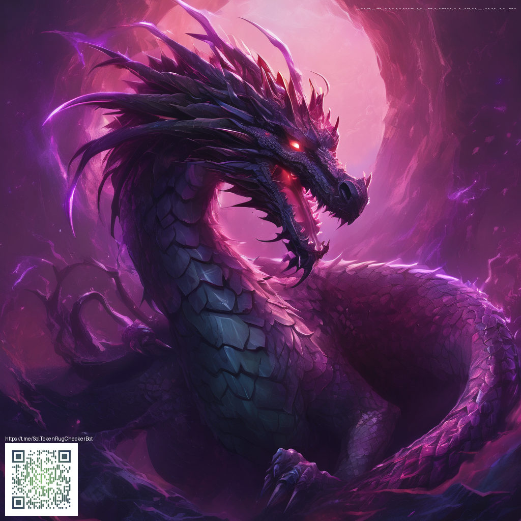
Embracing Transparency in Digital Paper Art
Transparency is more than a visual trick—it's a core principle that unlocks depth, atmosphere, and narrative in digital paper art. When artists layer translucent textures, they invite light to travel through the piece, revealing hints of what lies beneath and encouraging the viewer to move through the artwork with curiosity. In digital workflows, you can sculpt this sense of airiness by carefully balancing opacity, texture, and edge softness. The result is art that feels tangible even though it exists on a screen, with shimmering pockets of light that catch the eye and guide it forward.
Digital paper art thrives on a tension between clarity and suggestion. A single translucent layer can soften a harsh edge, while multiple overlapping sheets can create complex color interactions that would be difficult to reproduce with solid blocks of color. This approach is especially powerful when you want to convey atmosphere—fog, dusk, wet surfaces, or the subtle glow of backlit paper. As you experiment, you’ll notice how transparency can transform a flat composition into something with momentum, where every layer plays a role in shaping how the viewer perceives form and space.
Practical techniques to leverage transparency
- Layer masking and clipping to reveal select glimpses of texture beneath
- Opacity ramps that gradually shift from high to low transparency to create graceful transitions
- Blending modes like Screen, Overlay, and Multiply to merge translucent layers with subtlety
- Texture overlays at reduced opacity to add tactile depth without overpowering the composition
- Negative space as transparency to suggest form and movement without fully filling every area
Think of your palette as a study in light. Transparent layers often benefit from a restrained color range—cool tones can read as airy and luminous, while warm tones can feel cozy and inviting when filtered through soft transparency. The goal is to let light bounce through the layers, not just sit on top of them. When you pair translucent sheets with crisp, low-opacity linework, you create a harmony where edges breathe and the image feels both delicate and deliberate.
“Transparency is not about making things invisible; it’s about crafting stories where light can pass.”
In terms of workflow, begin with a strong, opaque foundation that establishes form and composition. Then introduce translucent layers one by one, testing how every addition alters the perceived space. Label your layers or use color tags to keep track of which textures are semi-transparent, which are soft shadows, and which are highlights. A well-organized approach saves time and helps you iterate toward a more cohesive, luminous result.
For artists who sketch ideas on the go or work across devices, having reliable and protective gear can make a meaningful difference. If you’re exploring using a mobile setup for digital paper experiments, a rugged phone case can help you stay protected during long sessions between cafés and studios. You can learn more about a practical option here: Rugged Phone Case — Impact Resistant Dual Layer TPU/PC Glossy.
In addition, exploring external resources can inspire fresh approaches to transparency. The gallery at https://sapphire-images.zero-static.xyz/2cbb1a45.html showcases how artists push translucency, texture, and contrast across a series of pieces. Even if the subject matter differs from your own work, you’ll notice how subtle shifts in opacity and layering can alter the mood and readability of an image.
As you become more proficient with transparency, you’ll start to see your compositions breathe in new ways. A slight adjustment to a layer’s opacity can transform a flat color field into a gleaming window or a misty veil. The interplay between light and material makes digital paper art feel alive, inviting the viewer to linger, scan for detail, and discover layers they hadn’t anticipated. It’s this sense of discovery that often sets standout pieces apart from more conventional digital illustrations.