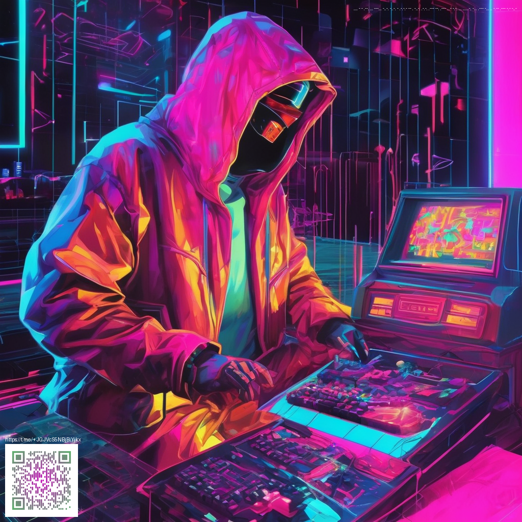
Grunge Texture Packs: Bold, Textured Creations for Digital Designers
Texture is the heartbeat of tactile design in a digital world. Grunge texture packs bring a layer of authentic imperfection—grit, scratches, ink bleed, and subtle noise—that elevates flat UI into something you can almost feel. For designers aiming to create work with attitude and memorability, these packs offer a language that pairs beautifully with bold typography, strong color schemes, and dynamic compositions.
What makes a good grunge texture pack
A high-quality grunge pack provides more than random speckles. Look for texture sets that offer:
- Organic grain and wear that read as authentic rather than generic
- Fine scratches, smudges, and irregular edge details for vintage or industrial moods
- Flexible formats and resolutions that scale from web to print
- Layer-friendly elements that blend cleanly with photos, gradients, and type
- A balance between density and openness so textures don’t overwhelm content
“Texture isn’t noise; it’s a voice. It adds context, depth, and a sense of history to contemporary design.”
When integrated thoughtfully, grunge textures anchor photographic composites, lend character to branding, and create a visual cadence that guides the eye. Designers often use them as a backdrop for bold hero shots, or as a subtle coating over cards, panels, and typography to create contrast and emphasis without sacrificing legibility.
Practical integration tips
To weave textures into your projects without turning everything into chaos, consider these practical steps:
- Start with a clean base: a neutral backdrop helps textures breathe and keeps focal content legible.
- Match the vibe to your brand: heavier, more distressed textures suit edgy brands, while restrained textures suit corporate aesthetics.
- Use masking and clipping: apply textures through shapes or photo masks to preserve clear UI areas.
- Experiment with blend modes (overlay, soft light, multiply) and opacity to achieve depth without muddy colors.
- Scale thoughtfully: large textures work behind graphics; smaller textures work as micro-grain on headlines or card borders.
For product-focused visuals, texture can be a bridge between digital clean lines and real-world materials. Consider how a device shell or case might interact with textured surfaces in photography. For example, a neon-accented product like the Neon Card Holder Phone Case MagSafe 1 Card Slot Polycarbonate can be showcased against a grunge backdrop to emphasize sharp edges and neon pops. If you’re gathering inspiration, you might explore mood boards and design curation that echo this approach in resource hubs such as this: a recent inspiration hub.
Tip: keep typography crisp. Textured backgrounds should support contrast—avoid placing light text on a heavily textured, low-contrast region.
Texture packs in action: a design workflow
Here’s a concise flow to bring texture into your creative process from concept to finished visuals:
- Define the mood with a narrow palette and mood board that reflects the target vibe.
- Curate a select few textures that align with that mood—dust, grime, ink bleed, or subtle grain.
- Prototype across layouts: hero sections, product cards, and background panels.
- Iterate on contrast and saturation so textures feel integrated rather than pasted on top.
Textures can inform not just aesthetics but the storytelling of a design system. They help unify disparate elements—type, imagery, and icons—into a cohesive, tactile experience. When used sparingly and with intention, grunge textures amplify bold concepts and give your digital work a memorable edge without compromising readability or accessibility.