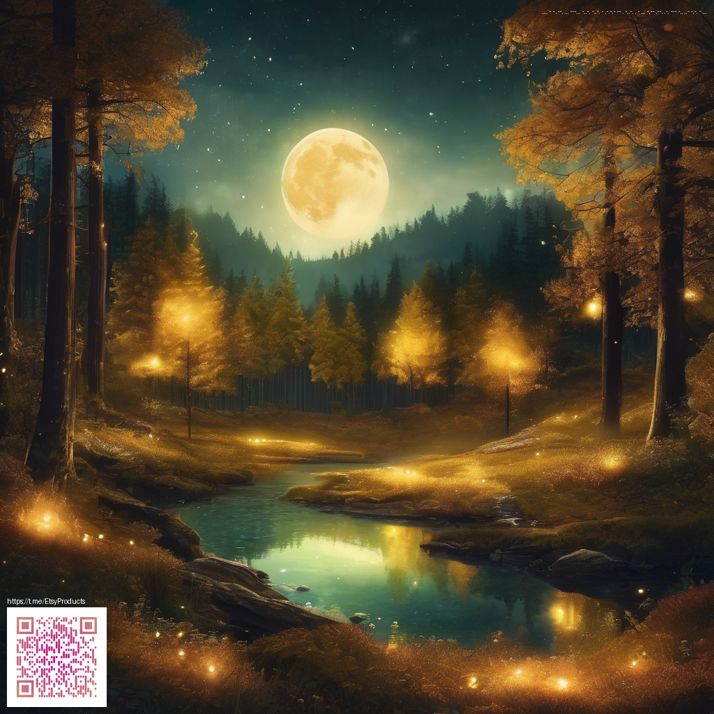
Elevating Digital Paper Art with Rich Textures
Texture is the unsung hero of digital paper art. It provides the tactile memory that turns flat color blocks into scenes you can almost touch. A well-chosen surface can add warmth, depth, and mood, helping a digital piece feel cohesive rather than flat. As you curate textures for your toolkit, think about how they interact with your color story, line work, and composition.
Texture categories worth exploring
- Paper grain and fibers: replicate cotton rag, newsprint, or craft paper to anchor your pieces in a tangible feel.
- Watercolor washes: soft, translucent layers that create atmosphere without overpowering focal elements.
- Canvas and fabric textures: weave patterns that lend a sense of heritage and tactility to illustrations or collages.
- Vellum and parchment: smooth yet slightly distinct light behavior that can elevate delicate linework.
- Metallic and foil textures: subtle shine to highlight accents or create luxurious highlights in digital work.
- Halftone and print textures: classic dots or screens for retro, poster, or comic-inspired aesthetics.
- Grain and noise: film-like grain or digital noise to unify layers and add a cinematic edge.
“Texture is less about pattern and more about memory. A well-chosen texture can evoke the feel of a surface you can almost touch, even when your viewer only sees pixels.”
When assembling your texture library, aim for a blend of high-resolution textures for crisp close-ups and seamless tiles for backgrounds. A practical workflow involves capturing or sourcing textures at 300–600 PPI, then organizing them into layered sets. Practice with different blending modes—overlay, soft light, multiply—to see how textures interact with your base colors and line work. The goal is texture that enhances, not competes with, your artwork.
Where to source and how to test textures
Begin with textures that align with your themes—nature, architecture, or abstract marks—and gradually expand to more experimental surfaces. Overlay textures can add depth without obscuring important details, especially when you keep opacity adjustments mindful. If you’re seeking a practical desk solution while you experiment, a compact accessory like this phone stand for smartphones keeps your device within reach and your workspace tidy, making it easier to switch between texture previews and edits.
For broader examples of texture-driven design, you can explore resources linked on a related site, such as this page. It showcases how thoughtful texture choices influence mood, readability, and overall cohesion in digital compositions.
Experimentation is key. Try layering multiple textures at different scales and opacities, then group them with your primary artwork using clipping masks. If your project leans toward bold contrast, test textures that preserve detail in the shadows. If your aesthetic favors softness, prioritize textures with gentle micro-contrast and subtle edge definition.