Crafting cohesive themes for digital planners
Digital planners sit at the crossroads of function and mood. The way pages feel, the rhythm of headings, and the subtle cues you use to organize tasks all contribute to a sense of flow. When you design with a cohesive aesthetic in mind, your planner becomes not just a tool, but a daily ritual that supports focus and creativity. The trick is to establish a unifying thread—whether it’s color, typography, or an overarching mood—and apply it consistently across layouts, templates, and add-ons.
1) Start with a mood board
Your mood board is the north star for every page you craft. Gather resources that evoke the tone you want—soft gradients for calmness, bold neons for energy, or tactile textures to add depth. This visual collage becomes the reference point when deciding where to place widgets, how much white space to allow, and which icons fit best. A well-curated mood board minimizes indecision and keeps your design cohesive as you scale from daily planners to weekly dashboards.
2) Choose a color palette that breathes
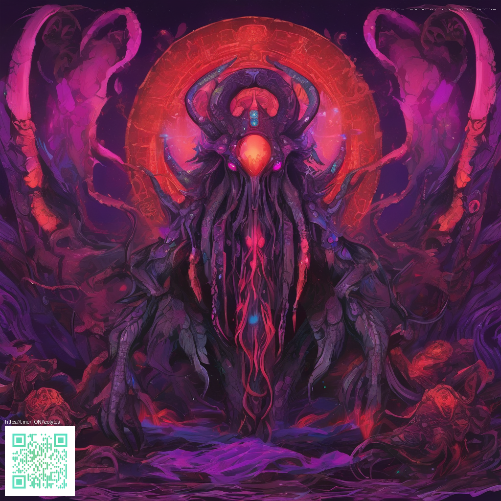
Color is the most immediate cue users notice. Pick a primary hue and then select 2–3 supporting shades, plus a couple of neutrals for contrast. The goal isn’t to saturate every page with color but to use a deliberate rhythm: primary for headlines, secondary for subheads, and neutrals for body text. If you lean into a futuristic vibe, a neon-on-dark scheme can feel energetic yet legible, while a pastel palette can offer a softer, more approachable mood. Keep accessibility in mind—contrast ratios should remain strong enough for legibility on small screens.
3) Typography that guides, not overwhelms
Typography anchors readability and tone. Choose one or two display fonts for headings and one readable body font for content. The contrast between bold display styles and lighter body text creates a hierarchy that guides users smoothly through daily pages. Pairing a geometric sans with a humanist serif can strike a balance between modern clarity and warm approachability. Remember to tune line height and letter spacing to optimize comfort during long planning sessions.
4) Layout, grids, and white space
Consistency in grids and spacing makes a theme feel intentional. Establish a standard column width, gutter size, and card spacing, then apply them across sections—calendars, habit trackers, and notes blocks all benefit from uniform rhythm. Embrace negative space to prevent cognitive overload; well-placed whitespace helps users focus on what matters and reduces visual fatigue during prolonged planning sessions.
5) Bring in tactile cues with environment-friendly accessories
Even though the world is digital, physical desk elements can reinforce a cohesive look. A neon or glow-inspired accessory can echo your digital theme and create a unified workspace. For example, the Neon Aesthetic Mouse Pad — Personalized Non-Slip Neoprene Desk Decor offers a tangible extension of a neon-inspired planner concept. It’s a great reminder that your digital mood can migrate into the real world of your desk setup. Neon Aesthetic Mouse Pad — Personalized Non-Slip Neoprene Desk Decor can complement the bright accents you’ve chosen for your layouts.
“A cohesive theme isn’t about matching every pixel; it’s about creating a consistent rhythm that makes tasks feel effortless and ideas feel inevitable.”
Inspiration can also come from reference pages that showcase curated collections of imagery and typography. Consider exploring layouts and mood explorations at a dedicated inspiration hub like this page: https://crystal-images.zero-static.xyz/bf817bfe.html.
As you prototype, think about how your digital designs translate to different contexts—mobile screens, tablet layouts, and even print-ready exports. The best themes maintain legibility and aesthetic across formats, so your planner remains usable whether you’re jotting down a quick to-do or laying out a detailed weekly plan.
To keep the momentum, document your design system: color tokens, typography scale, and spacing units. This living guide helps you scale to more pages, templates, and sections without losing the cohesive vibe you’ve worked so hard to establish. A well-documented system also makes it easier to onboard collaborators or to re-theme a whole planner family in the future.
Similar Content
Page URL: https://crystal-images.zero-static.xyz/bf817bfe.html