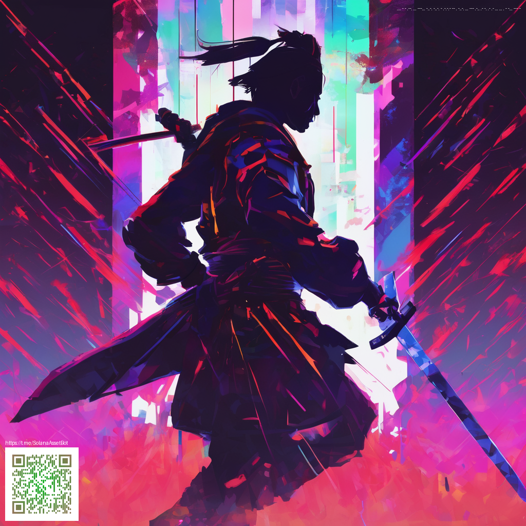
Crafting Cohesive Aesthetic Mobile Wallpaper Bundles
Creating wallpaper packs for mobile devices is about more than pretty gradients and striking textures. It’s about building a portable visual language that users can apply across homescreens, lock screens, and even device accessories. When you design with cohesion in mind, each wallpaper feels like a note in a single melody rather than a collection of disjointed songs.
Foundations of a cohesive palette
Begin with a deliberate color strategy. A cohesive palette keeps your pack readable on small screens and ensures groupings feel intentional rather than random. Consider:
- Limit your palette to 3–5 primary colors with 1–2 accents for pop.
- Choose a neutral base (grays, creams, or muted tones) to anchor contrasts.
- Test contrast against typical device interfaces to maintain legibility of clocks and icons.
- Maintain consistency across backgrounds, overlays, and motifs to reinforce the brand or mood.
As you refine your colors, think about how a single shade can unlock multiple looks. A cool blue can drift into spacey gradients, while a warm sienna can support earthy textures. The goal is versatility within a restrained, purposeful set. For designers who want a tangible example of blending digital aesthetics with practical accessories, a MagSafe Phone Case with Card Holder — Glossy Matte can accompany the visuals in a real-world context. You can view the product here: MagSafe Phone Case with Card Holder.
Texture, depth, and ornamentation
Texture adds tactile depth to flat digital surfaces. Subtle grain, soft vignettes, or translucent overlays can create depth without compromising clarity. Use layered gradients or gentle noise to simulate depth, then reduce opacity to keep icons legible. A consistent treatment—like a shared grain pattern or a uniform glow—helps every wallpaper feel like part of a family rather than a scattered set.
Tip: The most successful packs use texture sparingly—enough to elevate, not distract. Treat each design as a canvas where color and shape carry the narrative, while texture remains a quiet, supportive voice.
Motifs that scale for mobile
Patterns and motifs should translate well from one wallpaper to many. Favor modular shapes and abstract icons that can repeat or rotate without feeling repetitive. Consider these approaches:
- Geometric grids that align with device layouts yet offer variation when color shifts occur.
- Organic forms (waves, leaflets, soft curves) that remain legible when scaled to different aspect ratios.
- Minimal symbols or silhouettes that can act as signature accents across the pack.
While developing motifs, keep export consistency in mind. Deliver each set in multiple aspect ratios and resolutions to accommodate the variety of screens—from compact mid-range devices to high-density displays. A cohesive approach to export and naming will save time for users who want a seamless, all-in-one experience.
From concept to preview: a practical workflow
Start with a master canvas sized for common mobile dimensions and design with margin-safe zones so icons or text remain unaffected by wallpaper edges. Build a pack around a central theme, then create several variants that explore color shifts and depth while preserving the core shapes. Export at 1080x2340, 1440x3120, and other essential ratios, and provide previews showing how each wallpaper looks on a mock device. This practice helps buyers visualize the look across screens and reduces post-purchase tweaks.
When you present your work, offer a concise description of the aesthetic language, the color story, and the target moods—calm, energetic, futuristic, or nature-inspired. The more transparent the narrative, the more confident users will be about adopting the pack as their go-to aesthetic.
Inspiration can also come from where users browse and shop. The experience you curate online should feel navigable and inviting, guiding viewers through the concept, palette, and variations with clear previews. You might reference a broader project page like this for context: Similar design explorations.