Crafting Aesthetic Wallpaper Templates You’ll Love
Wallpaper templates have quietly become a designer’s best friend. They provide structure without stifling creativity, acting as a playground where color, texture, and typography can mingle in a harmonious way. When you invest time in building a reusable template system, you gain consistency across desktop, tablet, and mobile backgrounds—and you save hours you’d otherwise spend tweaking each new wallpaper for every device. In this guide, you’ll find a practical, actionable approach to creating templates that feel intentional and fresh.
1) Define your mood and palette
Everything starts with mood. Before you touch any tools, assemble a lightweight mood board:
- Identify a core emotion you want the wallpaper to evoke—calm, energy, or whimsy.
- Choose a 2–3 color palette that supports that mood, then add 1 neutral and 1 accent color for balance.
- Pair textures and finishes with clear typography styles to keep legibility intact across devices.
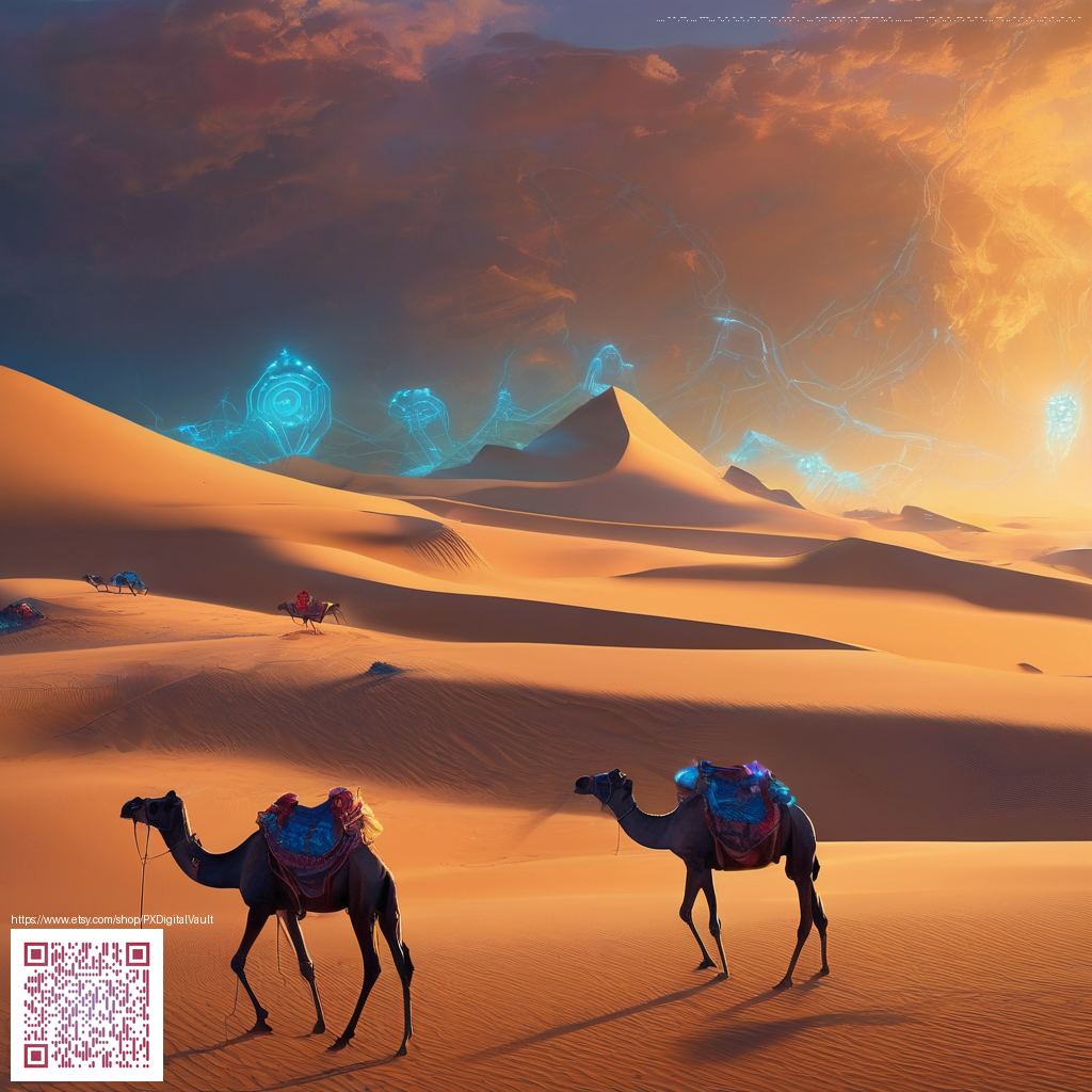
To keep the process grounded, note how the palette would translate to real life items, such as sleek accessories or stationery. If you’re after a cohesive aesthetic that extends beyond pixels, you might enjoy pairing your digital templates with a tangible accessory—for example, polycarbonate card holder phone case with MagSafe—to ground your vibe in daily use.
2) Pick your aspect ratios and grid
Wallpapers live in multiple spaces, so plan for common formats:
- Desktop: 16:9 or 16:10 for broad coordination with icons and widgets.
- Mobile: 9:16 and 9:18 variants to accommodate vertical scrolling and home screen layouts.
- Tablet and other screens: 3:2 or 4:3 to cover a wider range of aspect ratios.
Use a simple grid system (for example, a 12-column layout) to position key elements—your logo mark, motifs, and any typography. Consistency across templates makes it easier for viewers to recognize your style at a glance. For readers exploring further ideas, you can reference the design resources at https://000-vault.zero-static.xyz/e9553b70.html.
3) Build a modular template
The most valuable templates are modular. Create a base layer that stays constant, then add interchangeable components that you can swap in and out without disrupting the composition. Here are practical components to consider:
- Background: a softly textured gradient or a muted photograph filtered to preserve readability.
- Pattern overlays: geometric shapes, organic waves, or grain that add depth without stealing focus.
- Typography scales: a primary heading, a secondary line, and a small caption or date area—all sized to maintain legibility on small screens.
- Icon placeholders: weather, time, or calendar marks that can be toggled on or off.
- Safe zones: a clear margin area to ensure essential elements aren’t cropped on different devices.
“Templates succeed when they balance repetition with small, purposeful surprises.”
As you assemble these parts, keep a naming convention to stay organized—names like “bg-gradient-01,” “overlay-geo-02,” and “typography-main” help you locate and reuse components quickly.
4) Export, test, iterate
Export strategies matter just as much as the design itself. Save assets in the following formats and specs:
- PNG for crisp gradients and sharp lines on high-DPI screens.
- JPEG for photographic backgrounds where file size matters.
- Color space: sRGB to ensure broad compatibility across devices and apps.
- Sizes: create at least 4K (3840x2160) for desktops and 9:16 mobile variants (e.g., 1125x2436 or 1080x1920) for optimal results.
Test your templates by applying them on a few devices or mockups to verify alignment, readability, and impact. Don’t hesitate to tweak the balance between the background and the focal typography; sometimes a minor reduction in contrast or a subtle blur on the background is all that’s needed to elevate the overall feel.
If you’re looking for a practical companion to your digital toolkit, consider a tangible accessory that harmonizes with your aesthetic. The lightweight, protective polycarbonate card holder phone case with MagSafe can complement your workflow by keeping your essentials close while you design. For more inspiration, you may explore related ideas at the resource above.