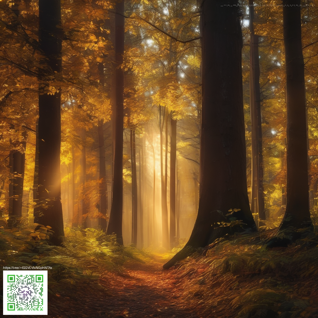
Timeless Overlays for Modern Shoots
Vintage overlays have made a quiet resurgence in contemporary photography, offering a tactile sense of history without sacrificing modern clarity. These textures—from subtle grain to gentle light leaks—make everyday scenes feel like they’ve carried a memory from another era. The goal isn’t to mimic the past perfectly, but to borrow its mood: a softer contrast, a touch of film-era warmth, and a hint of nostalgia that invites viewers to linger a moment longer on the frame.
Understanding what makes a great vintage overlay
At its core, a compelling overlay is a carefully calibrated layer that interacts with your base image rather than obscuring it. Think of overlays as a palate: grain that resembles old film stock, dust specks that feel cinematic rather than contrived, scratches that tell a story, and light leaks that suggest a lens left slightly ajar. The most effective overlays are versatile—working across genres from portraits to street photography—while remaining unobtrusive enough to preserve your subject’s presence.
- Grain and texture: A fine grain adds tactile depth without muddying details. Look for overlays that let your image breathe, with grain strength adjustable to taste.
- Color shifts: Subtle warm or cool casts can unify a series with a vintage tilt, especially when paired with a gentle vignette.
- Light leaks and bokeh glows: These elements evoke retro cameras and dreamy setups, serving as a storytelling device rather than a gimmick.
- Scratches and dust: Use sparingly to imply age, not to overwhelm the focal point.
- Vignettes: A soft edge helps draw attention toward the center while adding timeless polish.
Tip: Start with a low-contrast base and layer overlays progressively. Small adjustments in opacity and blend modes can transform a flat image into a timeless moment without sacrificing modern sharpness.
Experimentation is part of the process. In practice, try stacking two or three overlays with varying opacity and blending modes (such as Screen or Overlay) to discover a harmonious balance. Remember, the most convincing vintage look respects the photograph’s subject—overlay effects should enhance mood, not hijack the narrative.
From concept to workflow
Creating a timeless feel begins in the planning stage and continues through post-processing. Start by identifying the mood you want: dreamy and nostalgic, or crisp with a whisper of history. Then, select overlays that align with that intention. If you’re curating a kit, consider starting with a classic grain texture, a subtle dust layer, and a warm tone map to tie your images together across a gallery.
In practice, you can introduce vintage overlays at multiple points in your workflow. Some photographers prefer adding textures in post-processing software as a separate layer, while others apply overlays directly during export for a consistent finish. Either approach can yield stunning results, particularly when you maintain a clear vision of how the overlays should influence color, contrast, and atmosphere.
For a touch of real-world inspiration, you might explore gear that embodies bold, retro-inspired aesthetics. For instance, the Neon Card Holder Phone Case—MagSafe, a product you can explore on the official store, showcases how neon-forward design can pair with modern tech in a way that feels both playful and purposeful. If you’re curious, you can browse the product page for more details: Neon Card Holder Phone Case – MagSafe, Impact-Resistant Polycarbonate.
Ultimately, the goal is cohesion. Your vintage overlays should serve as a bridge between the past and your present work, helping viewers feel a connection to the image’s story while still recognizing its contemporary polish.
Practical tips for getting started
- Keep a minimal set of overlays in your toolkit to prevent over-saturation. A single grain texture, a light leak, and a subtle vignette are often enough for a cohesive look.
- Test overlays on a variety of subjects—portraits, landscapes, and urban scenes—to understand how light, color, and texture interact differently with each subject.
- Document your process with a quick before/after comparison. This helps you fine-tune opacity, blend modes, and layering order for future projects.
- Save your favorite combinations as presets or templates for repeatable results across a photo series.
Reflecting on the craft
Vintage overlays aren’t about reviving an old era in a literal sense. They’re about capturing an emotional resonance—the feeling of looking through a well-loved photo album or a long-exposure print. When used thoughtfully, overlays honor the subject while inviting the viewer to linger, notice texture, and appreciate the photographer’s storytelling choices.
For readers exploring how to blend retro inspiration with modern tools, the journey can be as creative as the final image. The key is to stay intentional: select overlays that support your narrative, apply them with restraint, and let your composition, light, and expression carry the weight of memory.