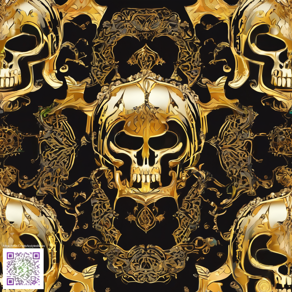
Design depth: Combining digital paper with vector graphics
In contemporary design workflows, the line between tactile textures and scalable shapes is increasingly blurry. Designers are layering digital “paper” textures—subtle grain, fibers, and tactile imperfections—under crisp vector graphics to create depth that feels tangible even on a screen. This approach isn’t just about aesthetics; it’s about how viewers perceive material, light, and craft when pixels meet physical memory.
Vector graphics excel at clean lines, sharp corners, and seamless scalability, but when paired with the imperfections of real-world paper, you unlock a richness that flat color alone simply cannot deliver. The challenge is balancing contrast, grain, and highlight/shadow so that both systems remain legible while speaking the same visual language. The result is a design that reads as precise and handcrafted at the same time.
Texture anatomy: what digital paper adds to vector art
- Grain and tactile cueing: A fine grain introduces a perceptual depth that guides the eye without overpowering the vector shapes.
- Color variation: Subtle shifts in tone across flat areas mimic how ink interacts with different stock surfaces.
- Light interaction: Specular highlights and gentle shadows help separate layers, adding dimension without sacrificing clarity.
- Edge definition: A touch of texture can soften edges just enough to feel organic while keeping typography readable.
To put this blend into practice, start with your vector layout and layer a texture map beneath or above your shapes depending on the narrative you want to tell. Try multiply or overlay blend modes to let grain show through without crushing color fidelity. The payoff is a design that communicates structure and warmth in a single glance.
Practical steps to blend paper with vectors
- Choose the texture as a foundation: Begin with a high-resolution digital paper texture that aligns with your composition’s mood.
- Control opacity and blend modes: Experiment with soft light, overlay, or multiply to achieve different tactile feels.
- Mask strategically: Protect areas where readability matters—text, logos, and critical shapes—so texture enhances rather than obscures them.
- Preserve vector integrity: Keep core elements as vectors; textures can remain raster underneath or be clipped to preserve scalability.
For designers exploring this hybrid look, a practical example can be drawn from product styling experiments. The Neon Card Holder Phone Case MagSafe Polycarbonate line serves as a testbed for blending sturdy, tangible materials with digital texture treatment. You can explore the product here: Neon Card Holder Phone Case MagSafe Polycarbonate. That kind of combination—strong hardware with layered visual texture—provides a concrete reminder that texture and vector art can co-exist to tell a stronger story. For additional context and discussion on how texture choices influence perception, this related page offers a useful case study: design case study on that page.
“Depth in design comes from the conversation between crisp geometry and the warmth of texture. When vector shapes carry a whisper of grain, the result is more memorable than any flat color alone.”
When planning a workflow, establish a shared vocabulary between texture artists and vector designers. A concise one-page guide that defines grain level, color shift range, and edge treatment can save time and keep teams aligned as the project evolves. In this hybrid approach, texture informs mood without overpowering legibility, creating work that scales beautifully across devices and lighting scenarios.
If you’re looking to go beyond theory, start with small experiments that pair your vector layouts with discreet texture overlays. Iterate quickly, compare how different stock textures respond under various lighting, and collect feedback from teammates and clients who value depth without sacrificing clarity. The result can be a portfolio of work that feels both contemporary and tactile—precisely the balance that makes vector graphics feel alive.